Work out whether the yellow cast follows your lamps, the paint or its surroundings before buying another white. Use this room-by-room comparison and sample checklist.
 Concept image
A wall that looks white at lunch and creamy after dinner does not automatically need repainting. Light and the paint’s undertone can both contribute. Separate those choices first: otherwise a new white may disappoint under the same evening lamps.
In this guide
Compare the wall in daylight and evening light
Choose one wall patch visible from your usual seat. Look at it in daylight with the lamps off, then again after dark under the lights you actually use. Keep the curtains, furniture and viewing position the same where possible. Write down what you see: creamy across the whole wall, a yellow pool near one lamp, or a difference beside the trim.
Next, compare your existing lamps one at a time. This is an informal room check, not a color measurement. Do not rely on a phone photograph as the verdict: judge the wall in person. The room image here illustrates a palette; it is not evidence of a lighting test.
Farrow & Ball explains that both daylight and artificial light affect paint appearance. That makes the timing of the change useful information, even though this comparison cannot identify a paint formula or isolate every cause.
Read the bulb before replacing it
Look for the Kelvin rating, written as K, on the bulb or packaging. ENERGY STAR’s explanation of light color describes 2700–3000K as warmer and more yellow, and 4000K and above as cooler and more blue. A warmer evening appearance may therefore be part of the light you chose, rather than a fault in the paint.
If you dislike that appearance, try one compatible alternative before replacing a roomful of bulbs. Compare it at the same wall patch after dark, then sit in the room for the activities you normally do there. The aim is a light you enjoy, not the whitest-looking wall at any cost. Follow the fixture’s bulb and dimmer requirements; changing a Kelvin number does not guarantee a particular paint result.
Use the pattern of change to choose the next check
| What you notice | What it suggests checking | What it does not establish |
|---|---|---|
| Creamy mainly after dark | Compare lamps and their Kelvin ratings before selecting paint. | It does not prove the paint has no warm undertone. |
| A stronger cast near one lamp | Compare that lamp with the other lights in the room. | It does not identify a defective bulb. |
| Creamy beside bright trim in daylight too | Compare actual paint samples against the existing trim. | The trim is another color, not a calibrated white reference. |
| Looks wrong only in the decorated room | View samples beside the floor, sofa and fixed finishes. | A photograph or color name cannot settle the choice. |
Use these observations to narrow the next comparison. Several influences can be present together, so avoid treating one row as a diagnosis.
Choose samples beside the finishes you are keeping
Benjamin Moore distinguishes warm whites with red, orange or yellow undertones from cooler whites with green, blue or violet undertones. Its advice to compare color strips against home furnishings is more useful than choosing from the word “white” on a label.
Put your candidates beside the existing floor, trim and largest upholstered piece. Compare them during the day and under the evening lighting you plan to keep. For a repaint, use the paint maker’s sample instructions and look at the candidates in the actual room before committing.
For example, if the wall seems too creamy beside a crisp-white door, compare each candidate beside that door rather than against an isolated screen image. If the door and floor are staying, they belong in the decision. Our suggested process is a way to organize that choice, not a claim that one named white works in every home.
Change the lighting, repaint or keep the warmth?
Try lighting first when the daytime wall suits you and the evening change is what you dislike. Choose the lighting you want to live with before making the final paint comparison; otherwise you are judging samples for a room you are about to change.
Compare paint samples when the wall still looks wrong under the lighting you want to retain. Note which neighboring finish causes the uncomfortable contrast. This gives you a more specific brief than “a white that never looks yellow.”
Keep the creamy backdrop when you enjoy the evening warmth but dislike the surrounding arrangement. Textiles and furniture can change the composition. They do not neutralize yellow light or remove a paint undertone. The two styling options below are for that choice.
Save a short comparison sheet
- Wall and viewing position: ___
- Daylight, lamps off: ___
- After dark, usual lamps on: ___
- Each lamp’s Kelvin rating, if available: ___
- Finishes staying: floor ___, trim ___, sofa ___
- Sample that works in both conditions: ___
- Next step: test one lamp / compare paint / keep the warmth.
Take these notes when buying samples or discussing the room with a paint retailer. A description tied to your real light and finishes is a better starting point than a photo that simply looks yellow.
Soft continuity: a solid cylinder and pale textiles
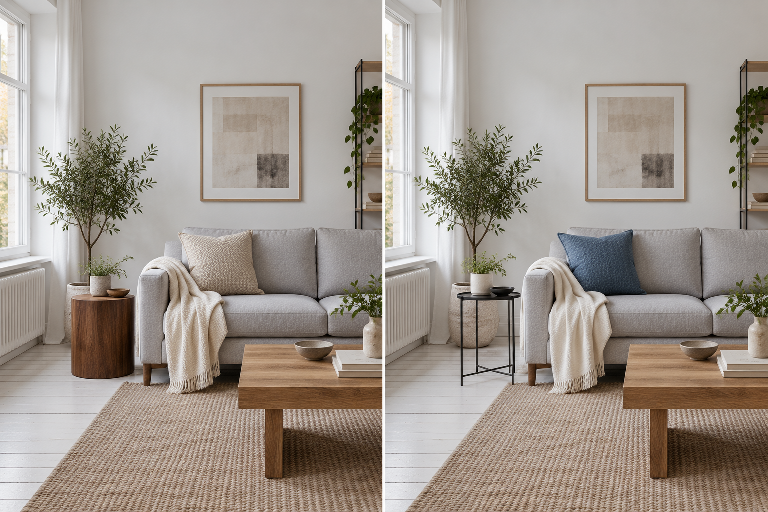
Pair an oatmeal cushion and ivory throw with a round walnut side table. The useful distinction is the table’s solid cylindrical shape: it puts a broad patch of brown beside the sofa, with no open space beneath the top. Its curved edge echoes the cushion’s rounded corners and the throw’s loose folds.
Oatmeal carries beige onto the gray upholstery; ivory offers a pale layer without making bright white the focal point. Try this combination if you like the wall’s creamy evening appearance and want a substantial wooden shape beside your seat. Keep the tabletop simple—a cup or small bowl leaves the wood visible.
Defined contrast: an open frame and a blue accent
Keep that same sofa-end arrangement, but use a slate-blue cushion, off-white throw and slim black side table. The open frame leaves the floor visible beneath the top, while its dark legs draw an outline beside the upholstery. If you prefer a more open-looking table base and a distinct accent on the sofa, use this arrangement.
Slate blue gives the eye a separate color to settle on; the off-white throw retains a pale connection to the wall. Black repeats the idea of an outline at floor level. This is a composition choice: blue and black do not neutralize yellow light or change the paint’s undertone.