Keep the palette light, then separate the surfaces with texture and one clear edge. Compare whites together so the sofa, wall and floor look intentional.
3 min read
Put your wall sample, sofa fabric and rug sample together in the room. Keep the combination you like in daylight and evening light, then add texture where you use it and one small contrast you can move.
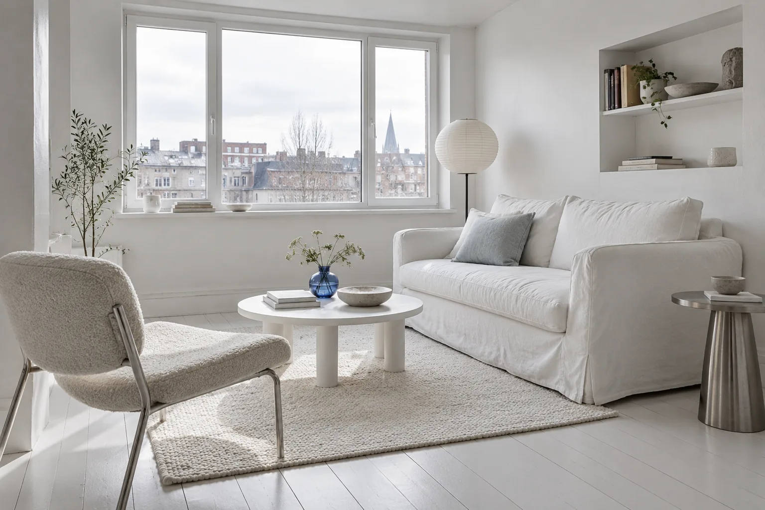 Concept image
Jump to an idea
Compare whites as a group
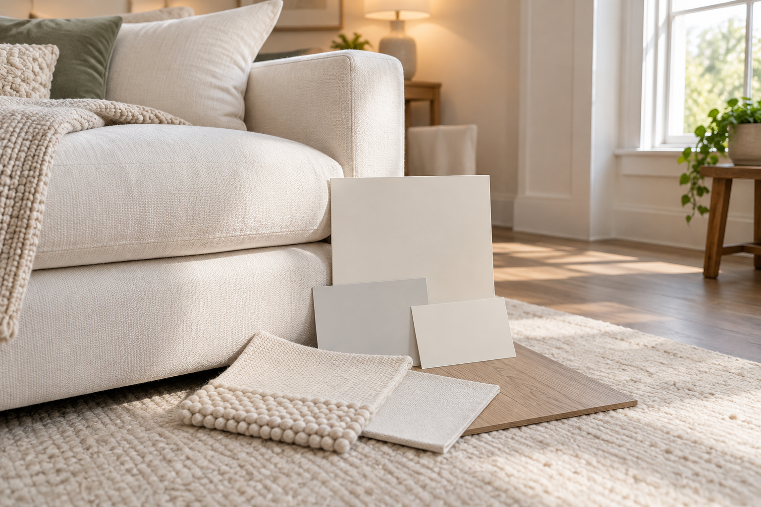
Lay the sofa-fabric and rug samples beside a wall sample instead of judging each alone. Include the flooring that will stay. White shades have different undertones, so two individually appealing choices can look unexpectedly yellow, gray or pink when they meet.
Check the grouping beside the window and again under your evening lights. If the wall makes the sofa look like the wrong color to you, change the sample before changing the sofa. A screen image is a starting point; it cannot reproduce your room's lighting.
Reference: Benjamin Moore: white and off-white paint colors.
Separate surfaces by what they feel like
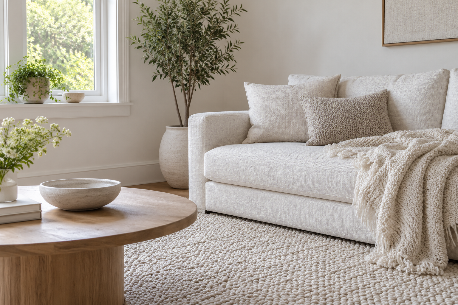
Give the biggest white areas different surface qualities: a smooth wall, a woven upholstery fabric and a rug with a visible knit or pile. Start with what you own. You are looking for differences you can see or feel, rather than collecting several objects in almost identical white ceramic.
Place the intended fabrics together and look from your usual seat. If everything blends more than you want, change one texture before adding more ornaments. This keeps interest in the surfaces already occupying the room.
Try one movable contrast
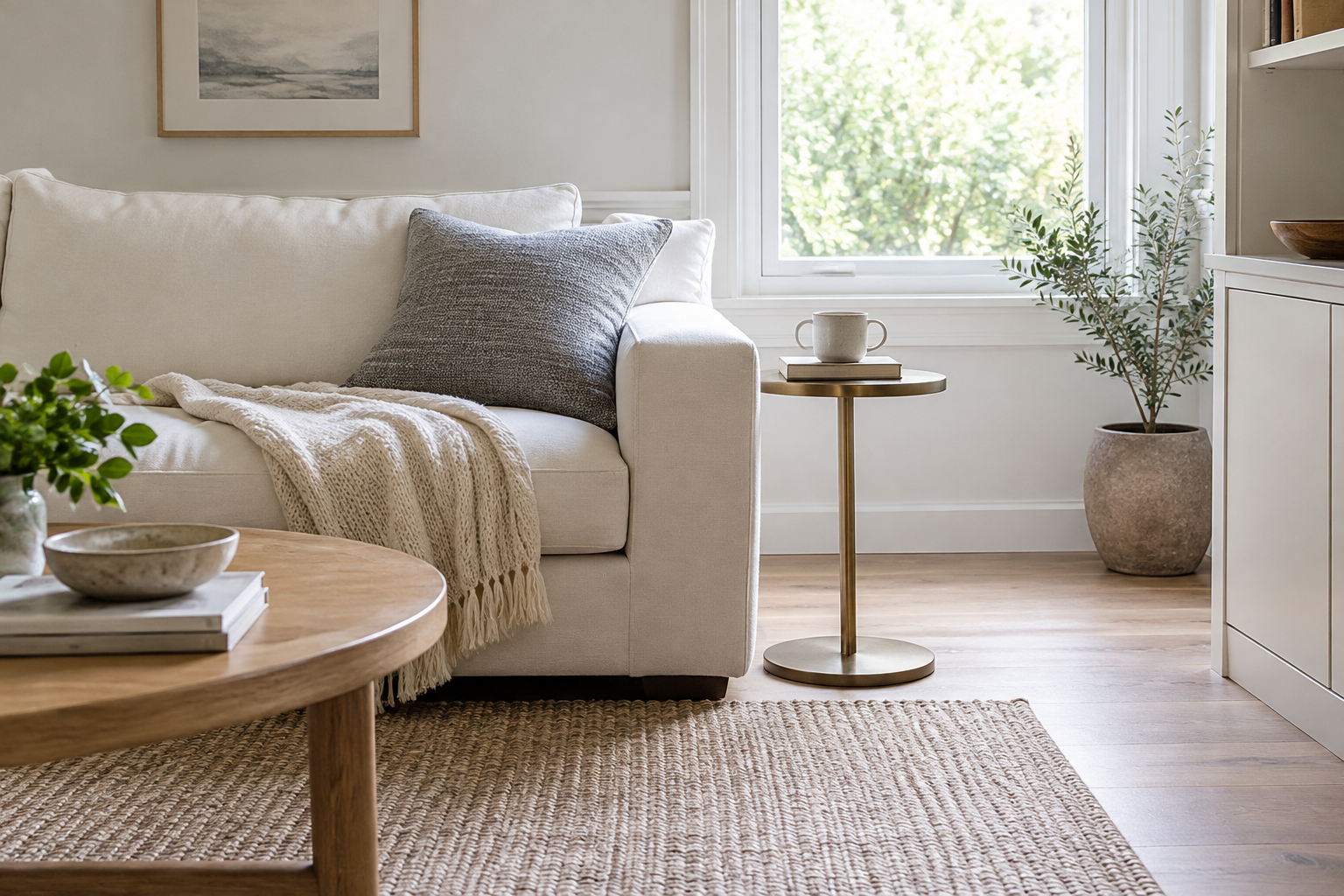
Use one small darker or colored element near a pale surface: a brushed-metal table beside the sofa, a blue vase or a gray cushion. Move it between positions to see where it gives the room a useful visual edge. Do not scatter matching dark accents everywhere simply to repeat a palette.
Check what the piece does when it is in use. A narrow side table can hold the book and mug you need; another decorative stand may just tighten the route. Keep the contrast that serves your routine and remove the extra one.
Make white upholstery a practical choice
For a slipcovered sofa, confirm which covers actually remove, their care instructions and whether replacement covers exist for that model. A loose-looking cover is not proof that every panel can be washed. Check the label for the fabric you are buying rather than assuming all white upholstery behaves the same.
Try your everyday arrangement with a throw you already have before buying a new sofa for its color. If the upkeep or exposed surfaces do not suit the household, put the pale palette into the walls, curtains or a washable textile instead. Keep a sofa that already works.
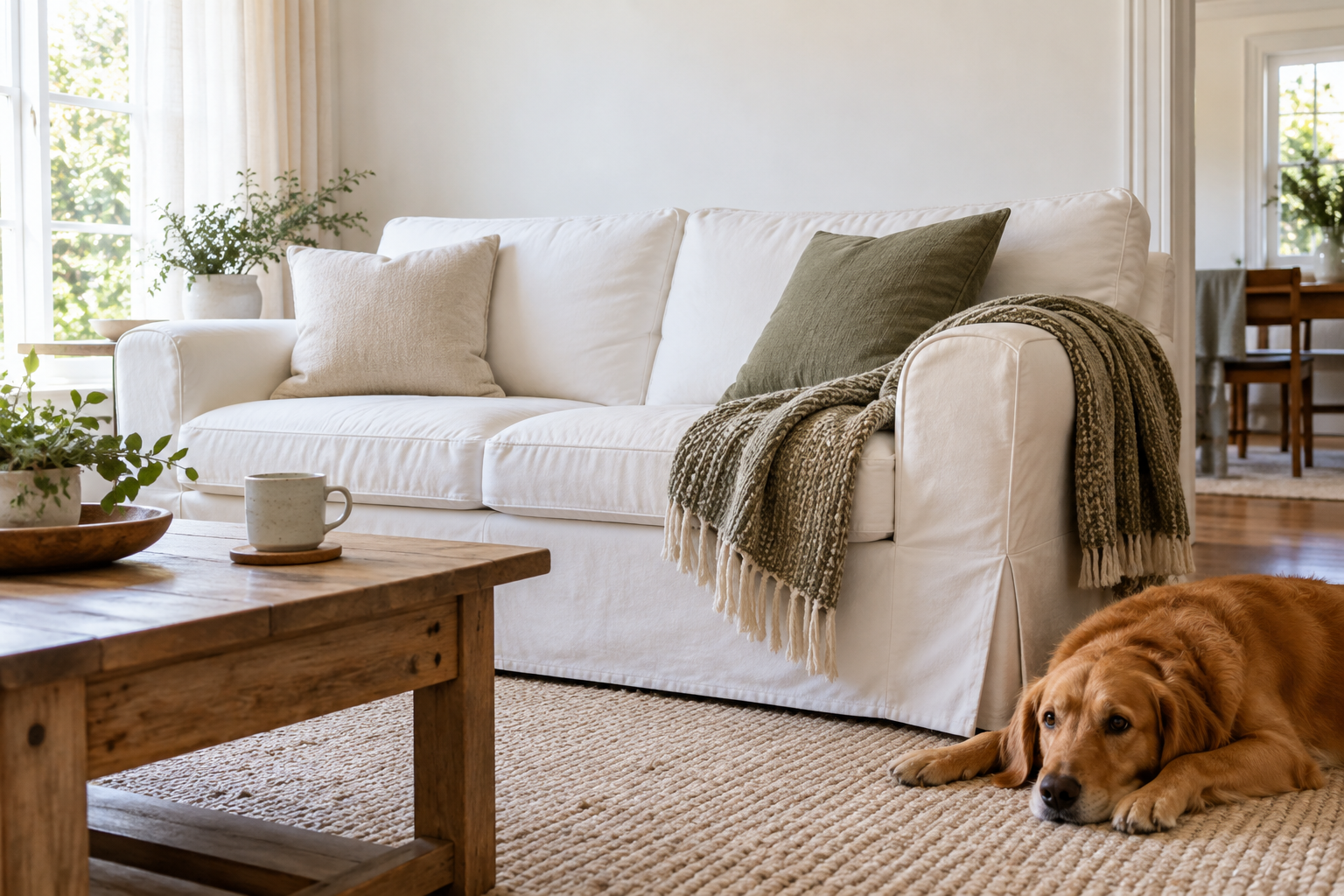
Warm whites and cool whites
Most whites lean slightly warm (toward yellow, cream or pink) or slightly cool (toward blue or gray). A room feels calm when the large white surfaces lean the same way. A cream sofa against a blue-white wall can make the sofa look dirty and the wall look cold. If you are keeping one white piece, such as the sofa or the flooring, choose the others to match its undertone. Holding a sheet of plain printer paper against each sample makes the undertone easier to see.
Light changes white more than any other color
North-facing rooms get cooler daylight, which makes whites look grayer; south-facing rooms make them look warmer. In the evening, your bulbs take over. Bulbs labelled around 2700K make whites look creamy; 4000K bulbs make them look crisp and cooler. If a white wall turns yellow at night, the bulbs are usually the reason; our article on why a white wall looks yellow at night explains how to check.
Texture ideas by surface
- Walls: a flat or matte finish looks soft; limewash or a lightly textured plaster gives subtle movement.
- Sofa: boucle, linen or a visible weave catches light differently from a smooth wall.
- Floor: a wool or jute rug with a chunky knit or flat weave adds the strongest texture.
- Windows: sheer linen curtains soften the light without adding color.
- Small things: a ribbed ceramic lamp, a woven basket or a wooden tray.
Living with white upholstery
Look for removable, washable covers, and check the care label before you buy rather than assuming. Fabrics described as performance or stain-resistant make spills easier to deal with, but read what the listing actually promises. A throw on the seat you use most and a washable cover on the arm take most of the wear. If you would rather avoid the worry, a warm off-white or oatmeal fabric gives nearly the same look and hides marks better.
A quick plan
- Collect samples of the wall, sofa, rug and floor and put them together in the room.
- Check them in daylight and under your evening lamps.
- Keep the undertones consistent.
- Give each large surface a different texture.
- Add one movable darker piece and see where it helps most.
Your quick check
- Wall / fabric / floor samples checked together: yes / no
- Evening palette still appealing: yes / change
- One texture to change: ___
- Upholstery cover removal and care instructions verified: yes / no
AI concept image. White tones on a screen are not paint or fabric color matches.