Choose a green kitchen around the floor and worktop you are keeping. Compare five material palettes, then use a sample check and a staged shopping plan to make one work in your room.
 Concept image
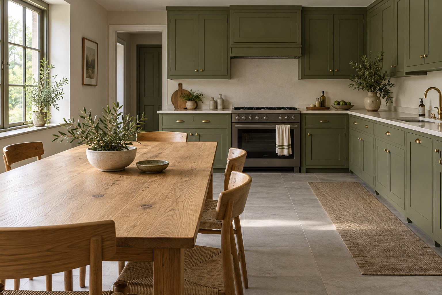
For green cabinets with visible wood grain, start with olive, an oak table, a cream backsplash and a striped cotton towel. Prefer a different emphasis? Choose emerald for tile geometry, sage for quieter surfaces, forest green for dark wood or blue-green for subtle silver details.
Explore the ideas
Start with the finish you cannot easily change
Before choosing a shade of green, list what stays: floor, worktop, backsplash, cabinet fronts and major appliances. Pick the most visually prominent fixed finish and compare your green beside it first. This prevents a favorite cabinet color becoming an isolated decision that every other surface must follow.
These are five styling proposals, not specified paint colors or tested material packages. “Pale stone” describes a look, not a promise that marble, quartz and every stone-effect surface perform alike. Get the exact supplier’s care, installation and sample information before selecting a worktop.
| Look | Start here if you are keeping | Keep the next choice simple |
|---|---|---|
| Olive and oak | A pale or medium wood table or floor | A quiet cream backsplash |
| Emerald and square tile | A simple floor and appetite for stronger color | Plain textiles around the tile grid |
| Sage and pale stone | A pale worktop with restrained pattern | Flat fronts and a plain curtain |
| Forest green and walnut | Dark brown dining furniture | An ivory background beside the darker pieces |
| Blue-green and silver | Visible silver-colored appliances or fittings | A limited set of narrow metal accents |
Treat the table as a shortlist. If your fixed finishes fit more than one row, compare actual samples rather than adding elements from all five looks.
1. Olive Cabinets With Oak Grain
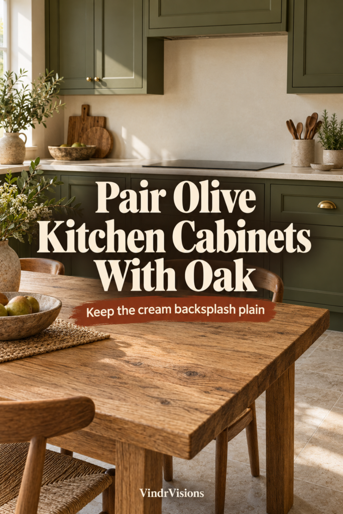
Choose olive cabinets with simple recessed-panel doors, an oak dining table and a cream backsplash when you want wood grain to remain part of the picture. The door frames provide an orderly outline beside the oak’s irregular markings; the cream surface gives both a plain background.
Use a cream cotton towel with olive stripes to repeat the cabinet color in one small, everyday detail. Let the table supply the strongest grain. If existing wood floors already have pronounced markings, choose quieter-grained oak and keep the backsplash plain rather than introducing another busy surface.
Try it without a renovation: place an olive paint sample beside your existing wood, then add a cream towel or piece of plain cream fabric. If the room already has a busy wood floor, compare that combination without introducing another grain. You can test the palette before deciding whether any cabinet work is worthwhile.
2. Emerald Cabinets With a Warm-White Tile Grid
Pair emerald cabinets with warm-white square tile for a look built around crisp color and repeated geometry. Simple recessed-panel fronts echo the tile’s straight edges without adding ornate profiles. Plain cream towels keep the textiles in the same pale family as the backsplash while leaving the grid visible.
Choose how strongly you want the joints to read: a contrasting grout color can emphasize the squares, while a similar warm-white color makes the grid less prominent. Compare those looks beside your floor. With patterned flooring, favor the quieter joints and leave patterned towels out of this combination.
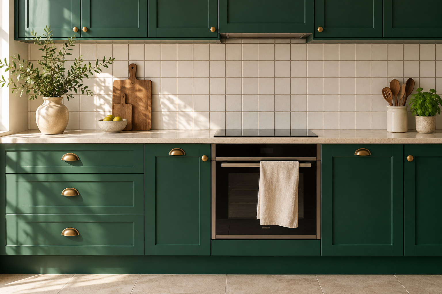
Make the tile decision: lay out several tile samples with the intended grout sample, not one tile on its own. Look at the repeated grid beside a cabinet sample. If the pattern becomes the first thing you notice, simplify the nearby textiles before adding another motif.
3. Sage Slab Fronts With Pale Stone
For a quieter composition, combine sage slab cabinet fronts with pale stone that has a restrained pattern. The uninterrupted doors give the stone’s markings room to register. Add an oatmeal curtain at a dining-area window and repeat that tone in a ceramic utensil crock with a subtly varied glaze.
Choose softly marked stone if you enjoy some movement across a broad counter; choose a more uniform-looking pale surface if existing floors or backsplash already supply pattern. Keep the curtain plain in either version. The appeal here is the contrast between flat cabinet color, soft fabric and small variations in the ceramic glaze.
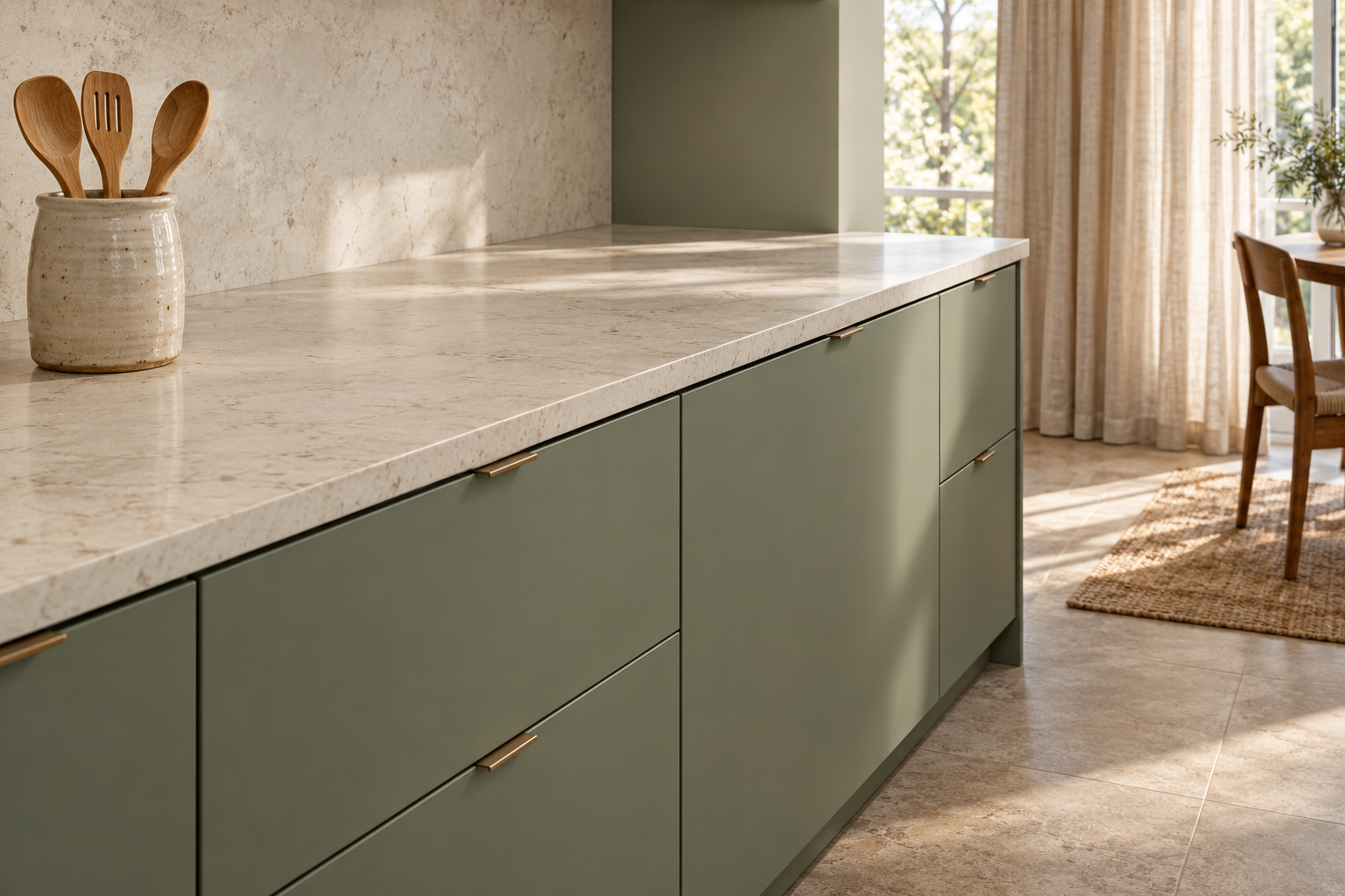
Compare the actual surfaces: bring together a cabinet sample and a worktop sample large enough to show its pattern. If possible, view a fuller slab or the supplier’s layout too; a small sample is only part of the design. Choose the visual relationship separately from the material’s maintenance requirements.
4. Forest Green With Walnut and Ivory
Choose forest-green cabinets with broad, simply framed doors, walnut dining chairs and an ivory backsplash if you prefer a darker wood-and-color combination. Keep the walnut concentrated around the table rather than scattering several wood tones across the kitchen. The ivory provides a pale surface beside the deeper cabinet color.
Plain ivory woven seat cushions repeat the backsplash color at sitting height and give the walnut chairs a softer-looking finish. If the kitchen already has dark wood flooring, use fewer visible walnut elements and keep the cushions unpatterned. Choose this over olive and oak when you prefer deeper brown grain alongside green.
Check the balance: start with the walnut piece you already own and try an ivory cushion or plain fabric beside it. If both cabinets and floor are dark, test a larger pale backsplash sample before adding more walnut. Keep the contrast you like without assuming that every surface needs to be deep brown or green.
5. Blue-Green Cabinets With Restrained Silver Details
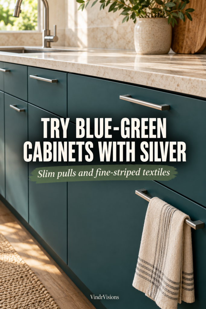
Pair blue-green slab fronts with a pale counter and slim silver-colored pulls for a cooler direction. Keep the metal concentrated in narrow lines across the doors and drawers, letting the cabinet color occupy the larger area. Use this combination if you like a clear hardware accent without making metal the main visual feature.
A fine-striped cream-and-gray towel repeats the pulls’ linear shape without adding another shiny surface. If an existing faucet or appliance already provides substantial silver-colored metal, let that be the larger accent and keep nearby accessories plain. Prefer this combination when the material contrast should come from color, pale surfaces and small metal details.
Check the existing metal: put a hardware sample beside the faucet or appliance that will stay. Decide whether you like the combination in person; “silver” is a broad color description, not an exact finish match. Confirm handle spacing before ordering replacements for drilled cabinet fronts.
Check the palette in your own kitchen
- Make one sample group. Put the green, worktop, backsplash and hardware candidates together beside the existing floor. Mark which finishes are fixed and which are still choices.
- Compare daylight and evening light. Farrow & Ball explains that both change how paint appears. Use the lights you expect to keep. Do not decide from the brightest moment alone if you mostly cook after dark.
- Remove one competing detail. If the group feels busy, compare it without a patterned towel, a second wood grain or strongly contrasting grout. This is a styling experiment, not a rule that kitchens must be plain.
- Record the actual samples. Keep supplier names, finish names and product references together. An AI room illustration cannot identify a real paint formula or certify a material match.
For example, keep a walnut dining set, compare forest green beside it, and use an ivory sample to judge the background. If that feels too dark in your evening light, compare a lighter green before buying a new dining set to suit the first sample.
Choose the smallest useful next step
If you already have green cabinets: begin with textiles and a single countertop accessory in the chosen palette. Photograph the arrangement for your own notes, but judge color in person. You may find the cabinet color works once a competing pattern has gone.
If you rent: test the idea with movable pieces and samples. Do not assume that painting, drilling or adhesive changes are permitted. A palette can guide a curtain or towel choice without becoming a cabinet makeover.
If you are renovating: settle the fixed material samples and practical specifications before treating towels and ceramics as final purchases. Confirm dimensions, handles, clearances and installation with the relevant supplier. The decorative palette is one part of a working kitchen.
Your shortlist: finish staying ___; green candidate ___; background surface ___; metal finish ___; one detail to leave out ___. Choose one next comparison, rather than ordering the whole illustrated room.
For a related color check, see why a white wall can look yellow at night.